Brand
One mark, one colour.
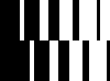
Five bars thinning left to right, in two offset rows. It reads as diminishing, and it echoes signal bars, inverted.
- Mark — Five columns on a 100 × 74 box. Use at 20px tall and above.SVG
- Mark, small cut — Four columns. Use between 12 and 20px, where the narrowest bar would disappear.SVG
- Mark, icon cut — Three columns on a square box. Favicons, app icons, avatars.SVG
- Wordmark — Riopex in sentence case, outlined to paths. Never set it live in another face.SVG
- Lockup, horizontal — Mark and wordmark on a shared baseline, one pitch apart. The default lockup.SVG
- Lockup, stacked — Wordmark ink width matches the mark width, one pitch below it.SVG
- Mark, Green-1 on transparent — For documents that cannot place an SVG.PNG
- Mark, Grey-0 on transparent — For dark grounds.PNG
- Lockup, horizontal, Green-1PNG
- Lockup, stacked, Grey-0PNG
- Favicon — The icon cut, three columns.ICO





The palette
- Green-1#004F2AThe page, the ink, the mark. One deep green owns everything.
- Green-2#31815ASecondary green. Matrix tiles.
- Green-3#9CCC9DText and rules on Green-1. Filled grid columns.
- Green-4#D3EFD4Pale tint ground.
- Brown-3#F2CEA9Peach board.
- Blue-3#BDDFEETinted board, screenshot slots.
- Accent-1#FFB0D5Pink poster ground. Part of the accent set.
- Accent-2#F06019Orange. The conversion block, and nothing else.
- Accent-3#FEBD12Yellow poster ground. Part of the accent set.
- Black#101010Headline ink on paper. Dark boards.
- Grey-0#F8F9FAThe off-white paper ground, and the ink on Green-1.
- White#FFFFFFPrint pages and type on saturated colour.

Using the mark
- One colour
- The mark is always a single colour, and always the colour of the text around it. Green-1 on light grounds, Green-3 on Green-1, Grey-0 on black.
- Clear space
- Half the mark height on every side of the mark or the lockup. Keep that space clear.
- Minimum size
- Full cut at 20px mark height and above. Small cut between 12 and 20px. Icon cut below that.
- Lockup proportions
- Both lockups are fixed artwork. Scale them whole, and keep the relationship between mark and wordmark exactly as drawn.
- Wordmark case
- Sentence case, always. A tracked all-caps setting suits a small label or merchandise, and the wordmark itself stays in sentence case.
- Typeface
- FK Grotesk Regular for display, General Sans Regular for text. Regular weight only, and emphasis is carried by a colour change.
- Motion
- The mark may thin in, every bar starting at the widest and settling to its own width, left to right. The wordmark stays still.
- Accents
- The three accents are a set. They appear together, or as a whole poster ground.
- Attribution
- Riopex is a product of Antitropy, LLC.
- Permission
- Use these assets to refer to Riopex accurately. The licence covers reference alone, so ask us first if you want to show a partnership or an endorsement.
- Anything else
- Ask us. If you are evaluating Riopex for a group rather than writing about it, the pilot request reaches the same people.
Keeping the mark intact
- 01
- Do not recolour the mark, or use more than one colour in it
- 02
- Do not apply gradients, outlines, strokes or effects
- 03
- Do not rotate, skew, stretch or condense the mark or the lockup
- 04
- Do not change the bar pitch or the bar widths, or redraw the mark by hand
- 05
- Do not place the mark on a busy photograph, or inside a box it does not need
- 06
- Do not set the wordmark in another typeface, in a heavier weight, or in italics
- 07
- Do not set the wordmark in all capitals
- 08
- Do not add a tagline, a strapline or a registered mark to the lockup
- 09
- Do not add a shadow, a glow or a rounded corner anywhere in the identity
- 10
- Do not use the mark as a bullet, a favicon substitute at the wrong cut, or a decorative pattern